In the first of three posts on using automated analysis with SAS Visual Analytics, we explored a typical  visualization designed to give telco customer care workers guidance on customers most receptive to upgrade their plans. While the analysis provided some insight, it lacked analytical depth -- and that increases the risk of wasting time, energy and money on a strategy that may not succeed.
Let’s now look at the same data, but this time deepen the analytical view by putting SAS Visual Analytics' automated analysis into play. We’ll use automated analysis to determine significant variables that impact our key business measure, X-sell and Up-sell Flag.
Less time spent on data discovery, quicker response time
The automated analysis object determines the most important underlying factors for a specific response variable, in our case the X-Sell and Up-Sell flag. After you specify a response variable, most of the remaining data items are added as underlying factors. Variables that are identical to the response variable, variables that have excessive missing values, or variables that have high cardinality are not added as underlying factors. For category responses, you can select the event level (category value) that interests you.
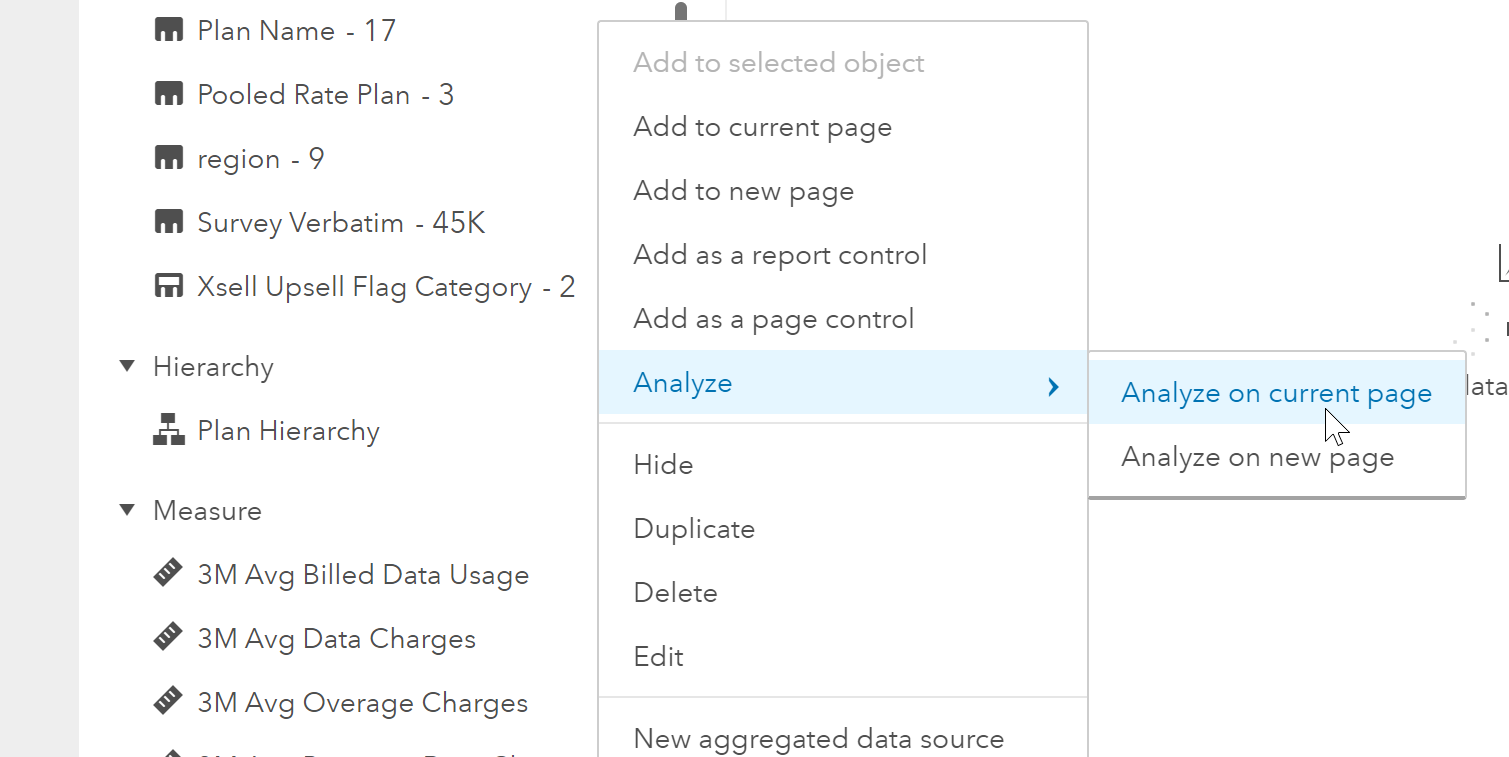
To run automated analysis, I will use the data pane and right click on Xsell and Upsell Flag Category, select Analyze, then Analyze on new page.
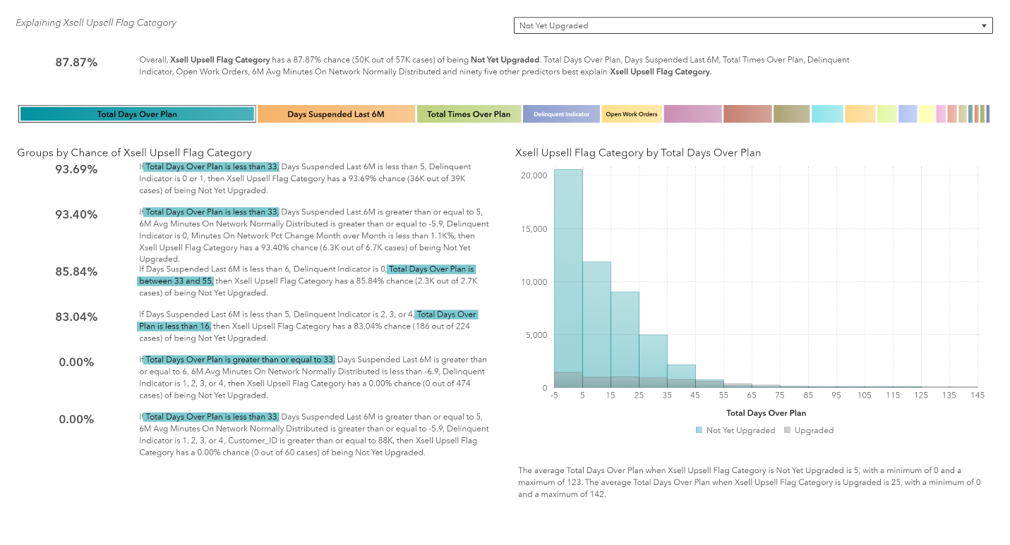
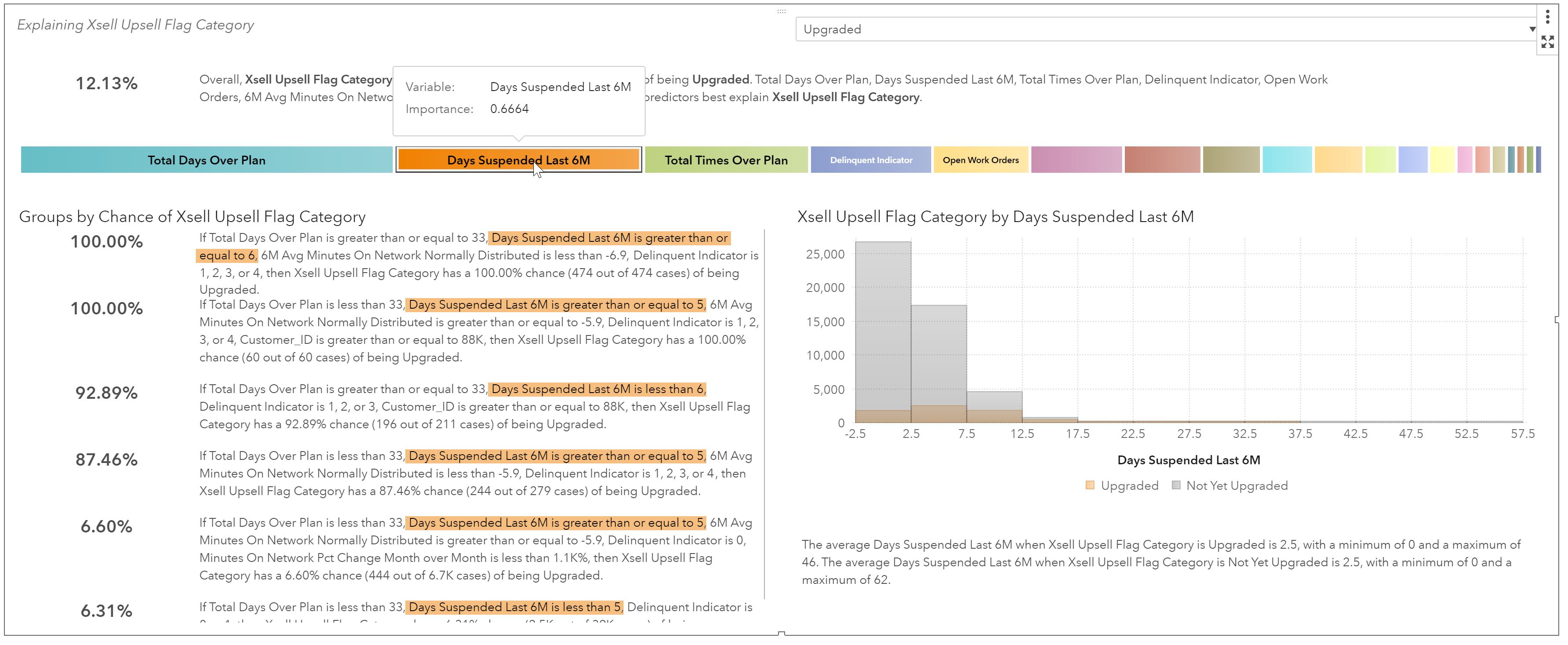
Here we see the results for Not Yet Upgraded.
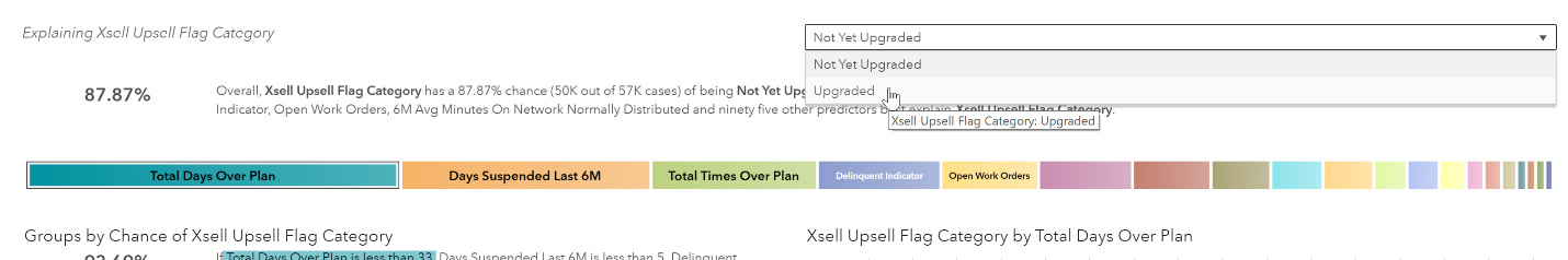
Seeing how we really want to understand what made our customers upgrade so we can learn from it, let’s change the results to see upgraded accounts. To do this I will use the drop-down menu to change the category value to Upgraded.
Now we see the details for Upgraded. Let’s look at each piece of information within this chart.
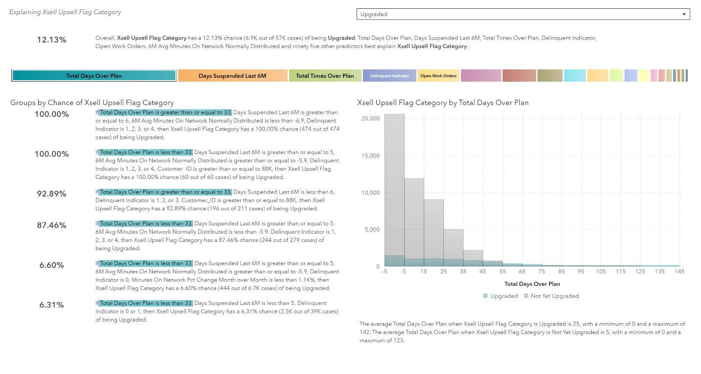 The top section tells us that the probability of a customer upgraded is 12.13%. It also tells us the other variables in our dataset that influences that probability. The strongest influencers are Total Days over plan, Days Suspended Last 6M (months), Total Times Over Plan and Delinquent Indicator. Remember from our previous analysis, the correlation matrix determined that Total Days over plan, Delinquent Indicator and Days suspended last 6M were correlated with our X-sell and Up-sell Flag. So this part of the analysis is pretty similar. However, the rest of the automated analysis provides so much more information than what we got from our previous analysis and it was produced in under a minute.

The next section gives us a visual on how strong each influencer is on our variable of interest, Xsell and Upsell Flag Category. Total Days Over Plan is the strongest followed by Days Suspended Last 6M followed by Total Times Over Plan…. If we mouse over each of the boxes, we’ll see their relative importance.
 After SAS Visual Analytics adds the underlying factors, it creates a relative importance score for each underlying factor. The most important underlying factor is assigned a score of 1, and all other scores are proportional to that value.

If I mouse over Total Days Over Plan I’ll see the relative importance score for that variable.
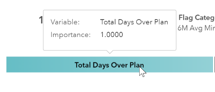
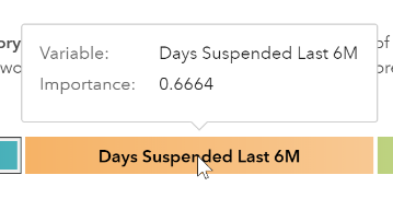
Here we see that Total Days Over Plan relative importance in influencing a customer to change plans is 1. That means it was the most important factor in predicting our variable of interest, cross-sell and up-sell flag. If I mouse over the Days Suspended Last 6M, I can see that the relative importance for that variable is 0.6664.
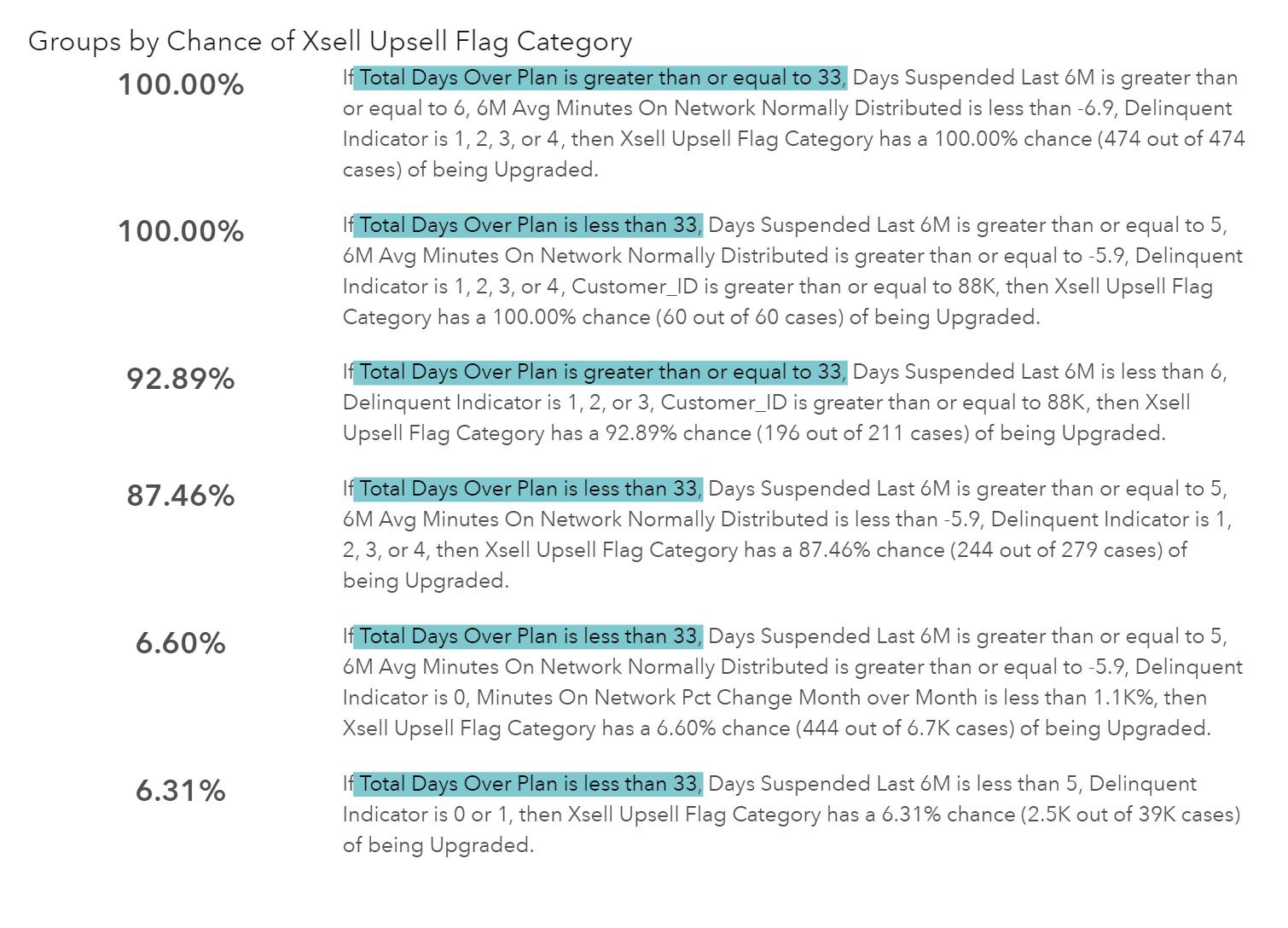
The percentages along the left-hand side give us the probability (or chance) of the subgroups of customers likely to upgrade. SAS Visual Analysis shows the top groups and the bottom groups based on probability. The first group of customers are 100% likely to upgrade. These customers have Total Days Over Plan greater than or equal to 33, Days Suspended Last 6M greater than or equal to 6, 6M Avg Minutes on Network Normally Distributed less than -6.9, Delinquent Indicator of 1,2,3 or 4. This means going forward, if we have customers that meet these criteria we should target them for an upgrade because they are 100% likely to upgrade. We can also use the next three customer groups to target as well.
For measure responses, the results display the four groups that result in the greatest values of the response. The results also display the two groups that result in the smallest values of the response. For category responses, the results display the four groups that contain the greatest percentages of the response. The results also display the two groups that contain the least percentages of the response.
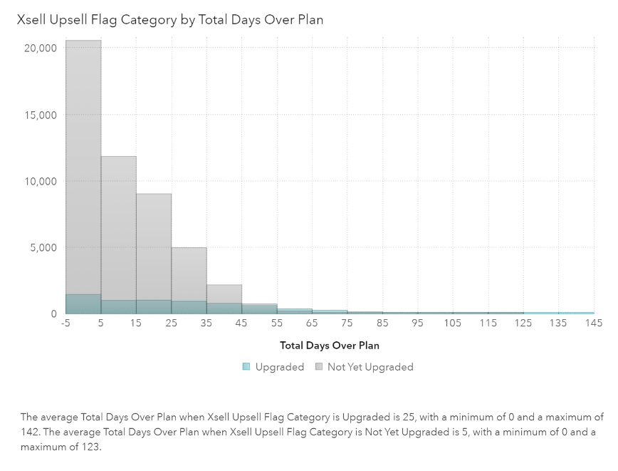
The bottom right chart shows how a variable relates to our variable of interest. Below the chart is a description outlining key findings.
An explanatory plot is included for each underlying factor. The contents of this plot depend on the variable type of both the response variable and the underlying factor.
If I click on Days Suspended Last 6M from the colored button bar, the informative text will be highlighted, and the plot chart will be updated to reflect my selection.
But what if you want to see all the variables analyzed and discover what actions were taken on them? If we maximize the automated analysis object we’d see a table at the bottom. This table outlines actions taken on the predictors.
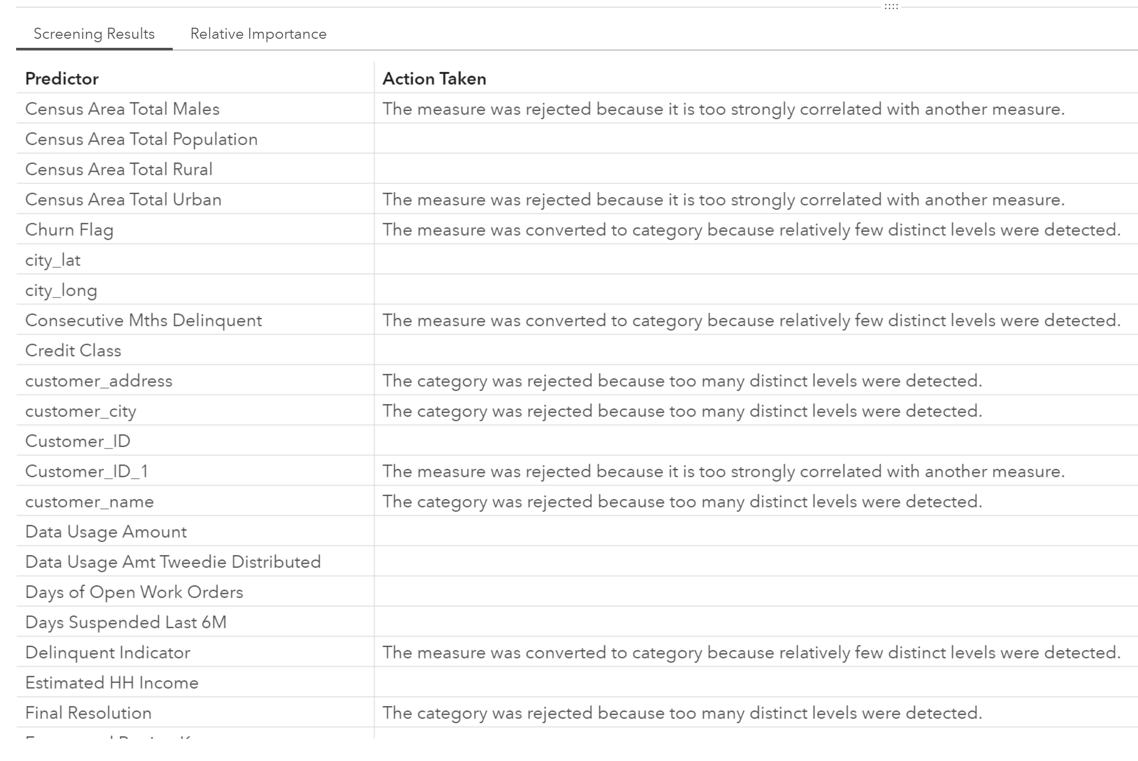
Here we see that Census Area Total Males was rejected because it is too strongly correlated with another measure. This reason would be easy for someone to miss and would affect the results of an analysis or model if that predictor was not removed. Automated analysis really does do the thinking for us and makes models more accurate!
Read Part 1 and Part 3
This is the second post of a three-part series demonstrating automated analysis using SAS Visual Analytics on Viya. Read the first post to learn about a common visualization approach to handling customer data that leaves room for error and missed opportunities. In the next and final installment, you’ll see how to turn the results from the automated analysis example above into actionable steps.
SAS® Visual Analytics on SAS® Viya® Try it for free!